Gallery Extension
The gallery extension provides a mechanism for creating "cards" using the !card command and allows for these items to be organized into a gallery with the !gallery command. The available configuration items for the extension are listed below, in Table 1.
Table 1: Configuration items for the alert extension.
| Key | Default | Description |
|---|---|---|
| active | True | Toggle for disabling the extension. This only changes the initial active state, use setActive to control at runtime. |
Cards
In general, a gallery is composed of cards; however, the 'card' command works as a stand alone command. The name "card" is derived from the materialize framework, which MOOSEDocs relies on for creating website content. The settings for the card command are listed in Table 2.
Example 1: Example use of the 'card' command.
!card level_set/vortex_out.mp4 title=Vortex Benchmark style=width:50%;
The level set equation is commonly used to for interface tracking, especially when the interface
velocity is known.
The level set equation is commonly used to for interface tracking, especially when the interface velocity is known.
Table 2: Settings for the 'card' command within the gallery extension.
| Key | Default | Description |
|---|---|---|
| style | None | The style settings that are passed to rendered HTML tag. |
| class | None | The class settings to be passed to rendered HTML tag. |
| id | None | Identifier to link against this object. |
| title | None | Title of the card. |
Gallery
A gallery is simply a collection of cards, to create a gallery simply wrap the card commands with a block-level gallery command as shown below. The available settings for the gallery command are listed in Table 3.
Table 3: Settings for the 'gallery' command within the gallery extension.
| Key | Default | Description |
|---|---|---|
| style | None | The style settings that are passed to rendered HTML tag. |
| class | None | The class settings to be passed to rendered HTML tag. |
| id | None | Identifier to link against this object. |
| large | 4 | Number of columns on large screens (1-12). |
| medium | 6 | Number of columns on medium screens (1-12). |
| small | 12 | Number of columns on small screens (1-12). |
Slideshow
A slideshow is a revolving gallery that displays one image at a time and cycles through them, either automatically on a timer or manually using the on-page controls. This is achieved using a block-level !slideshow command with a !slide command inside the block for each slide, as shown in Example 3. Each slide takes an image and an optional caption. The paired form of the command (!slide! ... !slide-end!) also accepts block content, such as a link to the relevant model, which follows the caption.
The caption and block content appear beneath the image by default, but overlay_default=True may be set on the !slideshow command to change the default behavior to have the content overlaid on the image. Additionally, the choice to overlay the content may be customized on each slide by setting the overlay option on the corresponding !slide command.
The slideshow displays an indicator dot for each image, and previous/next arrow buttons beside the slide and beneath the dots. Set side_arrows=False or bottom_arrows=False to remove either pair of arrows. By default it advances only when the viewer clicks one of these controls. Set the interval setting to a number of seconds to advance automatically; clicking an indicator or arrow then stops the automatic advance. The settings for the two commands are listed in Table 4 and Table 5.
Example 3: Example use of the 'slideshow' command.
!slideshow! interval=3 style=max-width:400px;margin-left:auto;margin-right:auto;
!slide application_logos/griffin_description.png caption=Griffin

!slide application_logos/grizzly_description.png caption=Grizzly

!slide application_logos/sockeye_description.png caption=Sockeye
!slideshow-end!
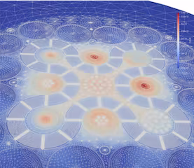
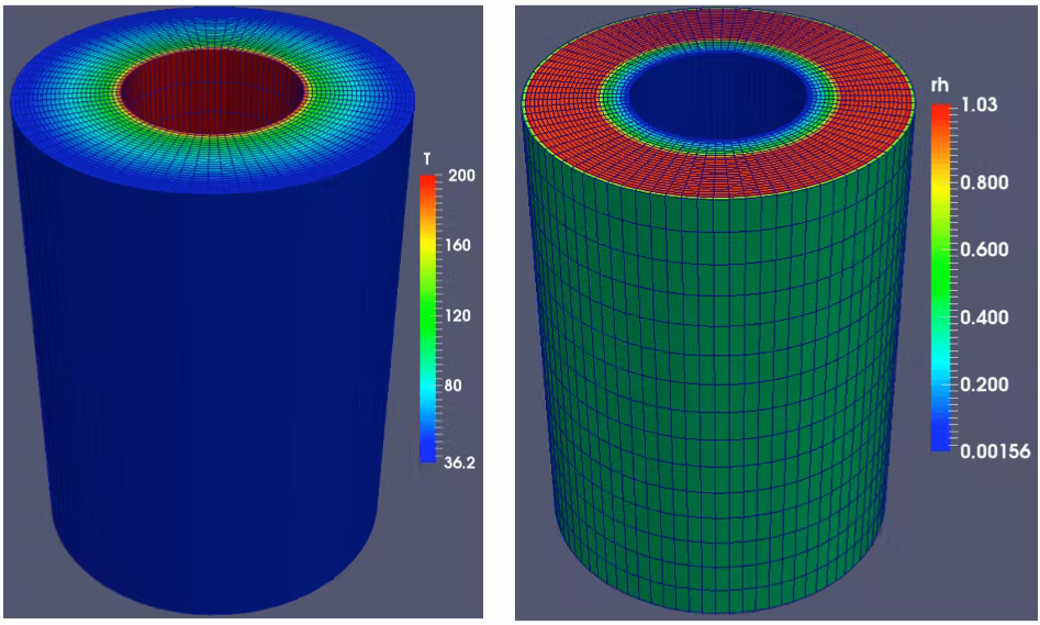
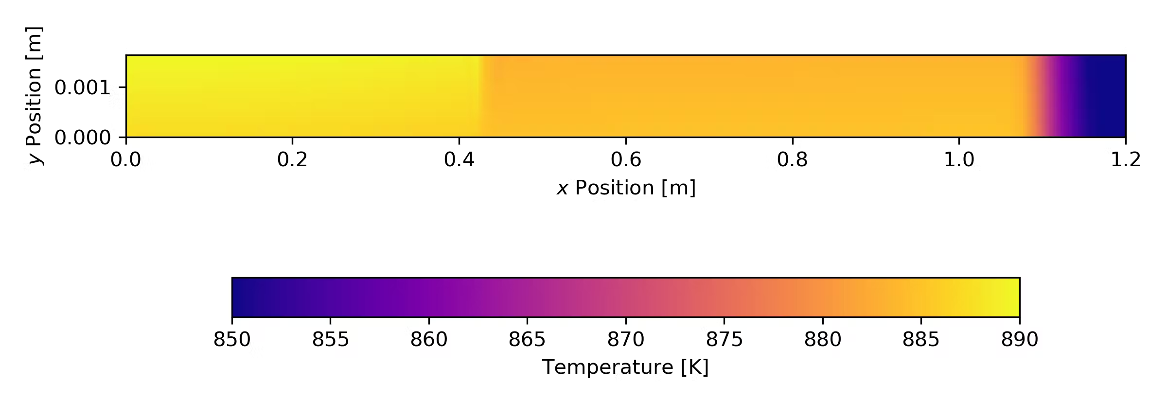
Table 4: Settings for the 'slideshow' command within the gallery extension.
| Key | Default | Description |
|---|---|---|
| style | None | The style settings that are passed to rendered HTML tag. |
| class | None | The class settings to be passed to rendered HTML tag. |
| id | None | Identifier to link against this object. |
| interval | None | Auto-advance period in seconds; if unset, slides advance only when the viewer clicks a control. |
| overlay_default | False | Default for the 'overlay' setting of each slide in the slideshow. |
| side_arrows | True | Display previous/next arrow buttons on the left and right of the slide. |
| bottom_arrows | True | Display previous/next arrow buttons beneath the indicator dots. |
Table 5: Settings for the 'slide' command within the gallery extension.
| Key | Default | Description |
|---|---|---|
| style | None | The style settings that are passed to rendered HTML tag. |
| class | None | The class settings to be passed to rendered HTML tag. |
| id | None | Identifier to link against this object. |
| caption | None | Caption text displayed beneath the slide image. |
| dark_src | None | Image to utilize with dark HTML theme. |
| alt | None | Alt text describing the image (defaults to the caption). |
| overlay | None | Overlay the caption and any block content on the bottom of the image rather than placing them beneath it; defaults to the slideshow's 'overlay_default' setting. |